Next.js Font and Image Optimization: Boosting LCP and CLS Scores
A complete guide to configuring next/font and next/image in Next.js to eliminate Layout Shift (CLS) and accelerate LCP.
Key Takeaways
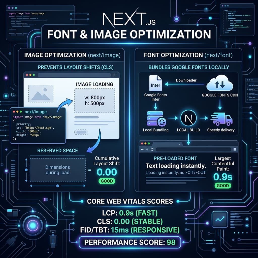
- next/font automatically downloads and serves Google Fonts locally during compilation.
- The next/image component handles responsive sizes and prevents Layout Shifts (CLS).
- Using fallback font settings eliminates flash of unstyled text (FOUT) delays.
Images and custom fonts represent the largest payload footprint on modern web pages. If they are not managed correctly, they will trigger severe performance bottlenecks: images without declared dimensions cause elements to jump around as they load, resulting in Cumulative Layout Shift (CLS), while heavy font files block page rendering or trigger Flash of Unstyled Text (FOUT).
Next.js provides two built-in solutions to optimize these assets out of the box: next/font and next/image. Understanding how to configure these components is key to achieving a 100/100 Core Web Vitals score.
1. Zero-CLS Font Delivery with next/font
In traditional websites, loading a web font involves referencing an external stylesheet from a service like Google Fonts:
<!-- ❌ BAD: Triggers extra DNS lookups and blocks rendering -->
<link rel="stylesheet" href="https://fonts.googleapis.com/css2?family=Inter:wght@400;700&display=swap" />
This model is bad for performance. The browser has to perform DNS lookups, negotiate SSL connections with fonts.googleapis.com, and download the CSS file before it even learns where the font files are hosted. While the font downloads, the browser either hides the text (Flash of Invisible Text - FOIT) or shows a system fallback font that shifts the page layout once the web font is loaded (FOUT).
The next/font Solution
next/font downloads web fonts during the build process and hosts them locally alongside your static assets. The font files are packaged directly in your deployment bundle, eliminating all external request overhead.
Here is how to set up Google Fonts inside your global Next.js layout:
// File: src/app/layout.tsx
import { Inter, Outfit } from 'next/font/google';
import './globals.css';

// Configure the primary body font
const inter = Inter({
  subsets: ['latin'],
  display: 'swap', // Show system font until Inter is downloaded
  variable: '--font-sans', // Define CSS variable for Tailwind integration
  adjustFontFallback: true, // Auto-adjust fallback font metrics to prevent CLS
});

// Configure a heading font
const outfit = Outfit({
  subsets: ['latin'],
  display: 'swap',
  variable: '--font-display',
});

export default function RootLayout({
  children,
}: {
  children: React.ReactNode;
}) {
  return (
    <html lang="en" className={`${inter.variable} ${outfit.variable}`}>
      <body className="font-sans antialiased text-gray-900 bg-white">
        {children}
      </body>
    </html>
  );
}
By setting adjustFontFallback: true, Next.js calculates adjustments for fallback fonts like Arial or Times New Roman. When the web font loads, it matches the size of the fallback font exactly, keeping the layout steady.
2. Advanced Image Optimization with next/image
The Next.js <Image /> component extends the standard HTML <img> tag with automated performance optimizations:
Aspect Ratio Enforcement
To prevent layout shifts, the browser needs to know how much space an image requires before it starts downloading.next/image enforces this by requiring you to provide either a width and height attribute, or use the fill layout parameter (which takes the size of its parent container).
Responsive Viewport Scaling
Never send a desktop-sized image to a mobile browser. Use thesizes attribute to tell the browser how much viewport width the image will occupy at different screen breakpoints. This allows the browser to request the smallest compatible image from the automatically generated responsive srcset.
import Image from 'next/image';

export default function FeaturedArticleCard() {
  return (
    <div className="card-container relative w-full h-64 md:h-96">
      <Image
        src="/images/blog/seo-trends-2026.png"
        alt="SEO performance trends infographic"
        fill // Forces image to occupy the parent container size
        className="object-cover rounded-lg"
        // Informs the browser about the responsive width of the image
        sizes="(max-width: 768px) 100vw, (max-width: 1200px) 50vw, 33vw"
        placeholder="blur" // Displays a blurred placeholder while loading
        blurDataURL="data:image/jpeg;base64,..." // base64 placeholder data
      />
    </div>
  );
}
Preloading LCP Assets
By default, the browser lazy-loads images to save bandwidth. However, lazy-loading your page's hero image or Largest Contentful Paint (LCP) element delays rendering.For above-the-fold images, disable lazy-loading by adding the priority flag:
export default function HeroBanner() {
  return (
    <header className="hero-section">
      <Image
        src="/images/hero-banner.png"
        alt="Technical SEO conference header banner"
        width={1200}
        height={600}
        priority // Enforces preloading
        className="w-full h-auto"
      />
    </header>
  );
}
3. Best Practices Checklist for Asset Optimization
- →Format Selection: Ensure your image loader converts assets to modern formats like WebP or AVIF. AVIF offers up to 30% better compression than WebP.
- →Static Imports: When referencing local assets, import the file directly (e.g.,
import logo from '../../public/logo.png'). Next.js will automatically calculate the width and height of the image during build. - →Subset Fonts: Only request the subsets you need (e.g.,
['latin']). Requesting character sets for multiple languages bloats the font file size.
Official References
Frequently Asked Questions
Why should I use next/image instead of the raw img tag?
next/image handles lazy loading, enforces correct aspect ratios, and serves modern formats like WebP or AVIF automatically depending on what the browser supports.
How does next/font prevent Cumulative Layout Shift (CLS)?
It calculates matching size adjust parameters for system fallback fonts, ensuring that when the web font loads, it doesn't cause content to shift.
What does the priority attribute do in next/image?
It tells the browser to pre-render the image immediately as a high-priority resource, which is critical for improving your Largest Contentful Paint (LCP) score for above-the-fold images.
How does next/image prevent Cumulative Layout Shift?
It requires you to specify width and height, or use the layout='fill' attribute, which reserves layout slots and prevents the page layout from jumping during load.
Why should I use next/font instead of standard web fonts?
next/font automatically downloads font files at build time, hosts them locally, and uses font-display: swap to eliminate render-blocking network requests.
Can I optimize external images with Next.js?
Yes. Add the external domain hostnames to your next.config.js configuration under remotePatterns. Next.js will optimize and cache external images on demand.

Founder & Editor, TechSEO Insights
The TechSEO Editorial Team writes practical SEO, AI tools, and web development guides based on hands-on research, testing, and real website optimization work.
Subscribe to TechSEO Insights
Get the latest guides on technical SEO, Core Web Vitals, and content marketing delivered straight to your inbox.
Privacy Note: By subscribing, you agree to receive our newsletter (Lawful Basis: Consent). We retain your email address until you choose to unsubscribe. For more details, view our Privacy Policy.